
Over the years I've collected quite the stash of bits and bobs, smallish stenciled swatches, leftover applique pieces, assorted spools of embroidery floss half gone, and scraps that aren't quite big enough for a garment but are too large to throw away. What is a girl to do with all these jumbled remnants? Make a throw, a crazy quilt, using as much of it as I can!

The idea first sparked when I noticed that a good portion of my stash colors were in line with the palette I was choosing for my new home. I started a Pinterest board, Cozy Throw, and added anything that piqued an idea or mood. Check it out to see what inspired me.
It became a game, a challenge to see just how much I could use without cutting into my good yardage. I was delighted to see some really nice pieces as I was digging deeper and deeper into the rabbit hole. Ultimately, I did cut some squares out of my whole cloth, but more than half of the throw is from odds and ends.

The key to a cohesive look is sticking to a color palette ~ white, natural, pewter, suede, and deep. This throw would be three rows, each row would be 16" wide. I cut out as many 16" pieces as I could from my stash. Some pieces were 16" x 16", some 16" x 10", some 16" x 6", some even smaller, etc. Then I cut out an assortment of 16" shapes from my yardage, creating swatches of two layers, one width being 16".
I stitched any existing stenciled pieces into swatches. I then laid these out on the ground and started adding the unstenciled pieces.
These were all pieces I had previously stenciled, just languishing in the bottom of a box. All I needed to do was cut a coordinating under layer for each and stitch them up.


I experimented with placement; top and bottom layered colors; switched colors so they flowed; kept in mind that the bottom colors would be visible in the final embellished pieces. I also thought about paint colors, thread and embroidery colors, and how different stencils would show more or less or none of the bottom layer, and how the design of the stencils worked throughout the quilt. I played and fiddled until I achieved a balanced and pleasing arrangement.

I pinned a note with a number for placement, stencil idea, paint color, thread and floss color, and in some cases the technique I would use. I took photos along the way so I wouldn't lose an order that I liked. The process is very loose. I'm not a very exact type of worker, and the freedom to switch something out is how I roll. I didn't know if each finished row would be equal in length.

I had extra pieces that I could add, lengthening or shortening a row if needed.


These pieces would be a ruffle (to add to the length) or a swatch like the one above with blank edges that can easily be cut down (to decrease the length).

Here the ruffle is worked into the quilt. I added a smaller ruffle onto the darker swatch to blend it into the whole better.
These type of swatches can be easily cut to any length, and thus great for filling in. I learned this little trick when I was making the flag quilt last year.

You can read all about the Traveling Veterans quilt here.

This swatch is actually some extra stenciling for applique that I did on this top.

Yes, the stenciling is on the wrong side, but this is a stash busting quilt, and I really wanted to use this piece. It fits in wonderfully.

It needed a little something extra, so I stitched a lovely saying onto it, "Shine like the whole universe is yours" by Rumi.

I placed a piece of tracing paper over the completed swatch. This tracing paper has been lying around our house for decades! It always stops me in my tracks to realize I now talk about time in not just years, but decades. I know it's been around that long because one of my kiddos decided to take a highlighter and scribble on each and every one of the pages. I love this little "memento" of stages gone by.
So.....I placed the tracing paper over the swatch and made a line and then wrote the words out. I made sure the spacing was good and not to misspell anything. I used an erasable pen and poked tiny holes through the paper to make a shadow of the words. Then I used a light gray Sharpie to trace over everything. I didn't know if I would get the stitching complete before the washable ink started to disappear.

You can see I really like using variegated floss. I used it on these swatches and more.


The upper portion shows the Alabama Chanin Daisy swatch after cutting out some of the top layer; and the bottom portion shows the swatch before it is cut.


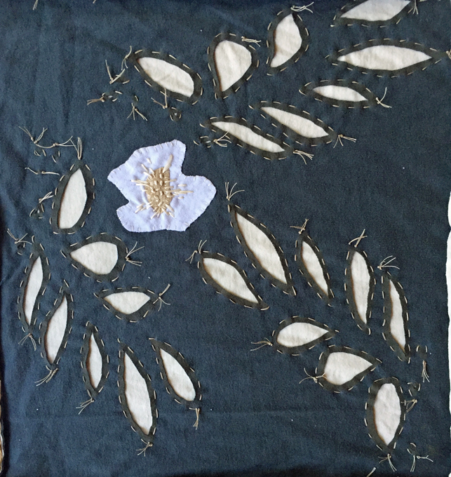
Above is the Alabama Chanin facets stencil. The top picture is the right side, and just above is the back side. Below is the Alabama Chanin fern stencil.

This medallion stencil I picked up years ago at Michael's. I needed something geometric amongst all the flowery designs.


I love the Alabama Chanin cotton gauze tape used for the petals. I knew I had a supply of white, but when it came time to stitch them, I couldn't find it anywhere! I was going to order more, but since I was in Portland visiting my fiber-geek friend, a little ribbon hunting was a fun adventure. Search as we may, though, it was nowhere to be found. I did discover a light gray cotton tape that was similar, so I made do with that. Of course, once I returned home with an almost completed swatch, I found my huge stash of white ribbon......right in front of me in the large wooden bowl near my cozy couch. Go figure.
Ribbon tape tips that I learned from Diane Hall at Alabama Chanin. Get a HUGE needle, and then find one even bigger. To make a petal, sew up from under the fabric. Then, instead of just sewing straight down through the fabric, bring the needle over the tape, and then sew down through the ribbon and the fabric. This should make the stitch look more petal like. If you pull it too tightly, you'll lose the effect. Ribbon sewing is still difficult, but this helped me.

Because it lends itself well to home decor and it's so quick to stitch up, I stenciled three swatches with the Alabama Chanin Paisley stencil.


Here's the poppy stencil I created for my yellow dress. You can read more about that here.

This is the Alabama Chanin Bloomers stencil. I appliqued an extra poppy in the middle because it needed a little pop of white to break up the expanse of darker fabric.
I stitched the last row onto the quilt while at Sit n Stitch this month. I love getting together with my stitching pals to see what they're up to. The next step was to blanket stitch the entire edge.
And Voila! The Stash Busting Throw is complete.

And the reverse side.... also pretty.

And here's my cozy stitching chair with the throw ready to warm me up on a chilly night while stitching on my next project.

What projects will you be stitching up this summer?


Love this palette and all of the different techniques you used. I was especially interested to see facets worked up as reverse applique (I usually only see it as negative reverse.) Only problem is, I think it's too beautiful to be on the couch, I think it is art and should be hung on the wall.
ReplyDeleteHi Sue~ Thank you for your kind words!! The palette is kind of a new direction for me, so I'm glad it turned out.
DeleteWow! Totally love this from palette to design. So much inspiration here. Thanks for sharing. My next project (a-line dress) is on hold until I mix paint and stencil. Can't use weather as an excuse; it has been beautiful here. Elsie
ReplyDeleteThank you, Elsie!! I've enlisted a friend for stenciling, and we've set a date so that neither of us can back out! I've got two weeks to plan and cut out a few projects.
DeleteGood strategy! Too bad Katie is sailing along Alaska. Her garage was perfect. Elsie
ReplyDeleteLove your color palette. So much design and detail goes into your work. It is obvious that you love what you are doing. Your photography is spectacular as usual!!! It was a lovely journey through your process . Thank you
ReplyDeleteVicki
Hi Vicki~ Thank you so much! I do love the whole process. It's like a good book, satisfying with a hint of melancholy when you reach the end...that is until you start the next one!
DeleteCompletely gorgeous!!
ReplyDeleteHi Helenko~ Thank you so much ~~
Delete